In this video I explain how to make a simple scatter plot in Microsoft Excel. I also demonstrate how to add a line of best fit or “trendline” to the data and how to properly format and label a scientific graph.
Related Posts
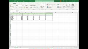
How to add and subtract multiple cells in Excel
View detailed instructions here: https://spreadcheaters.com/how-to-add-and-subtract-multiple-cells-in-excel/
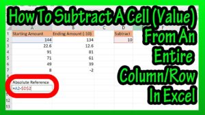
How To Subtract A Cell (Value) From An Entire Column Or Row In Excel Explained – Absolute Reference
In this video we discuss how to subtract a cell, or actually a cell value from a column or row in an excel spreadsheet. We go through a detailed example step by step. Transcript/notes Let’s say that you want to subtract a cell value from an entire column, such as in this example excel spreadsheet,…
How to Subtract a Percentage in Microsoft Excel : Microsoft Word & Excel
Subscribe Now: http://www.youtube.com/subscription_center?add_user=ehowtech Watch More: http://www.youtube.com/ehowtech Subtracting a percentage in Microsoft Excel is something that is accomplished by comparing the values of two distinct cells in a table. Subtract a percentage in Microsoft Excel with help from a professional programmer, designer, and developer in this free video clip. Expert: Geoph Essex Filmmaker: Victor Varnado Series…