🔥 Learn Excel in just 2 hours: https://kevinstratvert.thinkific.com
Learn how to create line charts in Microsoft Excel with this step-by-step tutorial for beginners. As full disclosure, I work at Microsoft as a full-time employee.
Find out how to insert a recommended line graph. Also, learn how to insert a line chart directly and edit the horizontal and vertical axes.
Use this chart type to show trends over time (years, months, and days) or categories.
In this tutorial, I use Excel that comes with Office 365; however, this should also work with all previous versions of Excel, like Excel 2019, Excel 2016, Excel 2013, Excel 2010, Excel 2007, and Excel 2003.
See all Excel tutorial videos here: https://www.youtube.com/playlist?list=PLlKpQrBME6xLYoubjOqowzcCCd0ivQVLY
– Learn the fundamentals of Excel in just 2 hours: https://kevinstratvert.thinkific.com
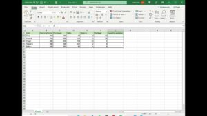
Access the sample data in the spreadsheet here:
https://1drv.ms/x/s!AmxrofZZlZ-whINXelPT0NCIU59XDw?e=Moux9T