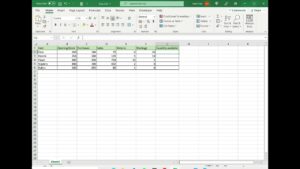
Excel 2013 combo charts combine two different types of charts into the same chart. Excel Video 464 shows you how easy it is to build combo charts. Combo charts are great when you want to save space or focus attention by showing two pieces of information with a different scale on the same chart. In today’s example we want to show the raw number of diabetic patients and the physician’s compliance with diabetic patient practice protocol as a percentage on the same chart. Normally if you show numbers and a percentage on the same chart using the same y axis scale, you can’t see differences in the percentage since the percentages are all less than one. Excel 2013 combo charts make it easy to see raw numbers and percentages on the same chart and Excel even builds the secondary y axis for you. If you’ve built these charts manually in prior versions of Excel, you’ll appreciate how much easier Excel 2013 combo charts are.
Excel 2013 is not finished making your charts easier to build. Stay tuned for more Excel Videos. Thanks for watching.