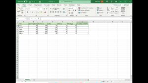
Excel Video 446 takes our discussion of Chart Titles to the next level. Watch how I use = to point the Chart Title to a cell where I can combine text and formulas to get much more customized titles. If you aren’t familiar with the INDEX and MATCH trick I use in the video, it’s a powerful combination of functions you can learn more about in Excel Videos 178-181. I also use the SLOPE function to determine whether my data is increasing or decreasing. Once you have the hang of it, you can build very robust formulas to make powerfully dynamic Chart Titles.
Chart Titles are great, but they aren’t terrifically flexible in terms of location. If you need more flexibility, try deleting the Chart Title and using a text box instead. You’ll have more flexibility with a text box in terms of formatting and location.
I hope you’re well on your way to making better charts in Excel. Stay tuned. I’ll have more chart tricks in the next Excel Video.


