📗 Get Your Video Workbook Template Here: »» https://cutt.ly/up4v1904G1FD
🎯 Get your message across powerfully with clean and clear charts. A clean clear chart gives your report the focus it deserves…learn how here!
======================================================================================
#Up4Excel
#Up4ExcelCharts
#Up4ExcelBeginner
======================================================================================
📖 today i’m going to be talking chart formatting and we’re going to go from a basic chart with something like we’ve got on the screen at the moment and we’re going to end up with something that looks like this which is infinitely more
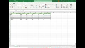
presentable hi john here and this is up for excel so we’re going to start with some absolute basic data and i’m just going to highlight that using some keyboard shortcuts which you’ll see on your screen and then alt f1 is going to give me an instant chart on the screen that we can then use so i’m just going to position this uh for you make it a little bit larger perhaps not quite that large and i’m actually going to produce another one so i’m going to highlight the exact same area and do another chart so that we’ve got a little reminder down there of what it used to look like before we improved it first thing we’re going to do clean up the chart axes and grid lines i’m just going to uh take excel off of full screen here so we can see the toolbars and when i click on the chart you’re going to see that we have some chart tools toolbars up here first one being design i’ve done an entire video going through all the different aspects of chart design so if you want a reminder on that check out my previous video on those so today we’re going to be focused mainly on the format toolbar and all the different aspects of this one thing that can make a chart look cleaner straight away is removing some of the axes and grid lines now of course the moment you do that you need to make some modifications to the chart so you can see what uh kind of the value things are there’s several ways you can do this actually to remove the answers well if you click on the axes you can just hit the delete key and that will remove them instantly but if i just undo that a second one thing you can do is you can say on the design page add a chart element you can say uh go to axes and you can just sorry grid lines whereas gridlines and you can remove them by just pecking an option on there so that is another way so i’ve taken those off right i’m actually going to remove the axes as well so i can either again click straight on it and hit the delete key and that will do that but we’re going to undo that at the moment or again add chart elements axes and you just the one that you want to get rid of you just highlight and click okay so the next thing we’re going to do is move around the titles and position our legend and things like that we’ve got a legend at the moment it’s down here so we can click on legend and we can move that to the top i think that’s a preferable place to have it so we’ll do that right now and i’m going to add a chart title now the interesting tip on this if we uh we can manually type in here anything we like so we can type in uh sales and profit
for example that’s fine but if we want to have a title on screen
company sales and profit we can actually dynamically link this title here by just putting that it equals that cell and hitting enter and that way if we want to modify the chart title at any point in time we can just type straight into here so we can say company x for example and you’ll see that that appears on the chart we’ll actually just go back to saying it’s called sales and profit and i’m going to make the font size much much larger and bolder and i’m also going to increase the size of that and make it bold legend and position that centrally as well okay right while we’re at it i think we will format that so again we can make that bold we can increase the size of the font so that’s looking a bit better
======================================================================================
Here at Up4Excel we’re on a mission to help YOU:
» Get your Excel skills UP and your task time DOWN
» Focus on shortcuts and fast impressive results
» Improve your productivity and free up your time
Everyone will assume you work 24 hours a day to produce the kind of output you’ll be producing in no time…. with the help of Up4Excel training.
You get new video releases every week, packed full of ways to save time and impress those around you.
💎 Don’t miss out and fall behind…..
🅾 SUBSCRIBE NOW 🅾 https://cutt.ly/Up4ExcelSub
======================================================================================
💥 Get a Shortcuts Cheat Sheet: »» http://www.up4excel.co.uk/shortcuts
🔓🔑 Remove Excel File Open Passwords: »» https://youtu.be/sSVX9xUow74
🎁 Your small gift will help me make better videos for you and others.
Thank You: https://www.paypal.me/Up4Excel