034. A better way to create Charts for SURVEY RESULTS in EXCEL

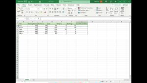
In this lesson, I want to show you how to create Charts for SURVEY RESULTS in EXCEL. You will learn a new type of chart to display survey results. With a few tricks, you will improve the quality of the discussion around the data you have collected.

Channel content: Excel, excel tutorial, Microsoft excel, learn excel, how to use excel, excel basics, basic excel, ms excel, office 365, excel for dummies, excel functions, learn excel basics, microsoft excel for beginners, excel course, Mr Excel, excel help, microsoft excel tutorial, excel tricks, excel tips, excel guide, how to in excel, tricks in excel, tips and tricks, pivots tables, excel formulas, advanced techniques for excel.

#Excel #MsExcel #Chart

Related Posts

How to Subtract a Percentage in Microsoft Excel : Microsoft Word & Excel

How to Subtract a Percentage in Microsoft Excel : Microsoft Word & Excel

Subscribe Now: http://www.youtube.com/subscription_center?add_user=ehowtech Watch More: http://www.youtube.com/ehowtech Subtracting a percentage in Microsoft Excel is something that is accomplished by comparing the values of two distinct cells in a table. Subtract a percentage in Microsoft Excel with help from a professional programmer, designer, and developer in this free video clip. Expert: Geoph Essex Filmmaker: Victor Varnado Series…

Language »
close
Thanks !

Thanks for sharing this, you are awesome !